ShopDreamUp AI ArtDreamUp
![Staff Member T-shirt design by me [UPDATE]](https://images-wixmp-ed30a86b8c4ca887773594c2.wixmp.com/f/c1df89dd-9340-4979-9b7e-10e79b4ffd4e/d88r32c-08c55ed0-363f-4f87-b8bf-a41c4d6a03a1.jpg?token=eyJ0eXAiOiJKV1QiLCJhbGciOiJIUzI1NiJ9.eyJzdWIiOiJ1cm46YXBwOjdlMGQxODg5ODIyNjQzNzNhNWYwZDQxNWVhMGQyNmUwIiwiaXNzIjoidXJuOmFwcDo3ZTBkMTg4OTgyMjY0MzczYTVmMGQ0MTVlYTBkMjZlMCIsIm9iaiI6W1t7InBhdGgiOiJcL2ZcL2MxZGY4OWRkLTkzNDAtNDk3OS05YjdlLTEwZTc5YjRmZmQ0ZVwvZDg4cjMyYy0wOGM1NWVkMC0zNjNmLTRmODctYjhiZi1hNDFjNGQ2YTAzYTEuanBnIn1dXSwiYXVkIjpbInVybjpzZXJ2aWNlOmZpbGUuZG93bmxvYWQiXX0.Hf73VvyRBuysOAOanCYEvefh0FbZWTntWrh7d7zs_bU)
Deviation Actions


Description
"Our identity is as much yours as it is ours, so we wanted you to have all of the pieces to bring it to life in your own ways. Download, share and create as you see fit." Spyed
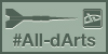
This t-shirt is my idea , and is for all the staff members who work day and night for the community . For a better navigation and experience ! Thank you !
Hope you like it.
Feel free to comment / critique .
Available in my fb page too:
www.fb.com/georgebart
instagram.com/georgeehf17
If you like PLEASE:
 This is the First design ... but .. I decide to change .
This t-shirt is my idea , and is for all the staff members who work day and night for the community . For a better navigation and experience ! Thank you !
Hope you like it.
Feel free to comment / critique .
Available in my fb page too:
www.fb.com/georgebart
instagram.com/georgeehf17
If you like PLEASE:
This is the First design ... but .. I decide to change . Image size
820x875px 96.79 KB
© 2014 - 2024 GeorgeXVII
Comments16
Join the community to add your comment. Already a deviant? Log In
Greetings! I value your openness to allow the community to critique your piece. <img src="e.deviantart.net/emoticons/s/s…" width="15" height="15" alt="
Less is more.
It's not uncommon that when designing a shirt, one is compelled to make sure the audience gets a swig of the swag. Which is great, but can be overwhelming when the naked eye doesn't have a focal point.
Instead of bombarding the viewers with logos on all sides (sleeves), pick one part of the shirt to place the logo. I would suggest the front of the shirt as the presenting stage.
The upper squared DA logo would work if it was the only thing not competing with the "Staff" lettering; and the other two logos depicted. I would additionally lose the small DA logo in the "A". The "Deviant Art" lettering works stellar with the opaque neon logo. I would see this as the strongest part of the shirt design.
In many shirts the word "Staff" is written on the upper back, this could be something you may want to consider.
The Typography looks more like "Stiff" and "Stitt", rather than "Staff". I feel that you could use a different font for Staff much like the black lettering for "Deviant Art".
I know this is a shirt design but a suggestion would be to include stock models to present to your viewers what the shirt would look like when being worn.
I encourage you to play with other colours besides white. You may find a more appealing palette that goes with neon green.